

In the grocery store, intuitive design is all about how to get the customer to spend more money without making it obvious. Customers don’t like to feel tricked or manipulated, so any gentle guidance from the retailer to get them to purchase more items must be done without being noticed. From the way people walk around the store, to the way the items are stacked on the shelf, everything about a grocery store can be coded into making the retailer more money.
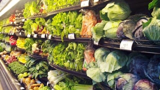
Even the customer’s first step into the store can be calculated to keeping them inside more. Many grocery stores have a designated entrance and a designated exit that are far apart from each other, so if a customer wishes to leave, they have to walk past more product before reaching the exit. Often the first things customers see are the produce and floral departments, with the bakery nearby. These bright colors and tempting smells gives the illusion of having fresh, natural and healthy products. With careful lighting and a spritz of water, fruits and vegetables become irresistible, even though that spray of water can make the produce go bad sooner. To give a better, more refreshing quality to your store, background music is also important. It slows the consumer down and raises the time spent in store by up to 34%. Once you’ve slowed them down, by removing external time cues like windows or clocks, shoppers are more likely to lose track of time instead of rushing out.
By putting staples like dairy products at the very back of the store, customers must be in the store longer and go past items that may not be on their list, but upon being seen, trigger an impulse buy. Stocking the perimeter of the store also keeps shoppers moving, the end caps being critical to flow, and even selling products 8 times faster compared to being shelved elsewhere. And those must-have items, the things you use every day or can’t imagine going without, those are strategically placed in the middle of the middle aisles. Again, it’s all about spending more time in the store, passing more items.
Even which shelf those items in the middle of the aisle in the middle of the grocery store matters. The bottom shelf is all about store or generic brands and bulk products. Those looking to save money already know where to go, so no need to waste valuable eye-level space for those products. The top shelf is usually for gourmet items, or local and smaller brands. The middle shelves are where manufacturers get the most bang for their buck. The products there are right at eye-level, popping out and begging to be bought, that’s where the best sellers go. Some grocery stores even sell this space to manufacturers so their product can get the best real estate. Similarly, those sugary cereals are right at thigh-height, perfect to catch a child’s eye.
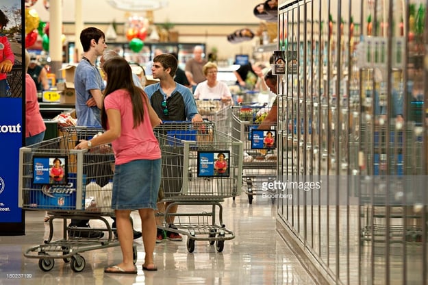
Even having a larger cart encourages customers to try to fill it (leading to 40% more in sales). The most important thing about having an intuitively designed grocery store is all about location, location, location. So “go with the flow” of how the customer thinks they want to shop, and get them to stick around longer.